.png)
Project Management
Burn up chart 101: What are they and how to use them?
A burn-up chart is used frequently by agile and scrum project managers. The graph has two lines that display the work that is planned and the one that tracks the work that has been accomplished.
To understand how efficiently your team members have been working, a burn-up chart can be one of the best project management tools you would need.
A part of the Agile project methodology, it is also used by scrum teams as the burn-up chart can be analysed to evaluate where the improvements can be made and how to cover the remaining tasks during meetings.
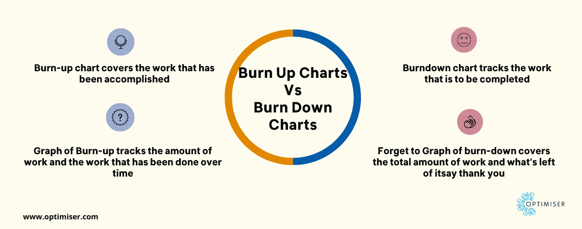
Difference between the Burn-up chart and Burn-down chart
A burn-up chart and burn-down chart are used popularly to track data visually over time. But there are differences between the charts. It lies in the data that they track over time.
A burn-down chart tracks the amount of work that is to be completed across the graph at the top. The second line tracks the work that has been completed, beginning from zero and increasing to the right as more tasks are accomplished.
A burn-up chart begins with total work and the graphs cover the remaining over time. As the work progresses, the line will begin to decrease towards the right.
To keep it simple, burn-up charts evaluate work that has been done to date and the burn-down chart covers the work that has to be done.
Reading a burn-up chart
Across the X-axis of a burn-up chart is the time period or also known as the sprint number. The story point delivered or the amount of work that is to be completed is displayed along with Y-axis.
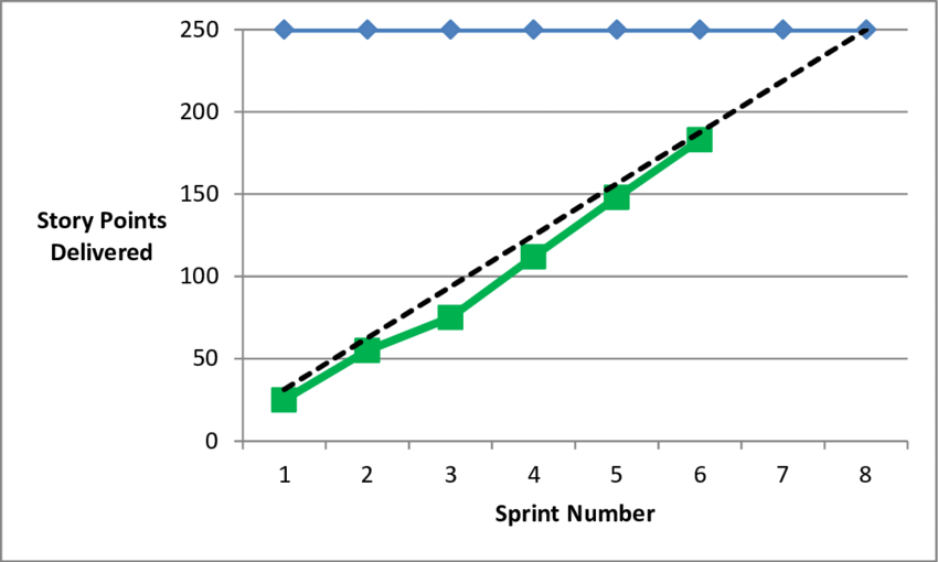
- The blue line on top displays the number of story points planned, which is the work that will be delivered by the end of the project.
- The dotted black line is the work planned or the planned completion of the story points
- The green line is the actual number of story points that have been completed. Every sprint gives you a picture of how the work was being completed.
Key points to watch out for while reading a burn-up chart:
In project tracking tools offered by Optimiser CRM, you can use burn-up charts to keep your projects ahead of the deadline while tracking the progress of others.
You may also like: Steps to using a Sales Analytics tool to grow your business
But to do that, you have to keep the following points in mind:
- If the blue line displays any changes, work has been added or removed from your project.
- If the black line changes, the change was made to the baseline plan that covers how much of the work will be covered in every sprint.
- If the green line is under the black line, it means your project is falling behind schedule.
- If the green line is above the black line, your project is ahead of the schedule.
SUMMARY
Burn-up charts are the most useful means for keeping track of projects when you are running on tight-knit deadlines. Agile project management methodology with burn-up charts allows project managers to get a closer glimpse into the performance of the teams and how there are to be further improvements.

30 days free trial. No credit card required