
Best practices for using white space in web design
The negative space that is the unmarked area within the web design and around the elements such as texts, logos, and imagery is known as white space. There are different types of white space that are:
- Kerning, or the spaces between text blocks and between each letter.
- Margins on the page
- The white space around/ within the images on the webpage.
Around the first half of the 20th century, white space began to gain more popularity among artists and designers. Since then, it has been recognised as versatile means to balance the visuals of a website. It can be used to direct the attention of the visitors towards a certain element as well as improve their experience during their visit. White space is not always white, it can be a solid colour as well, and serves as an important element while designing a website.
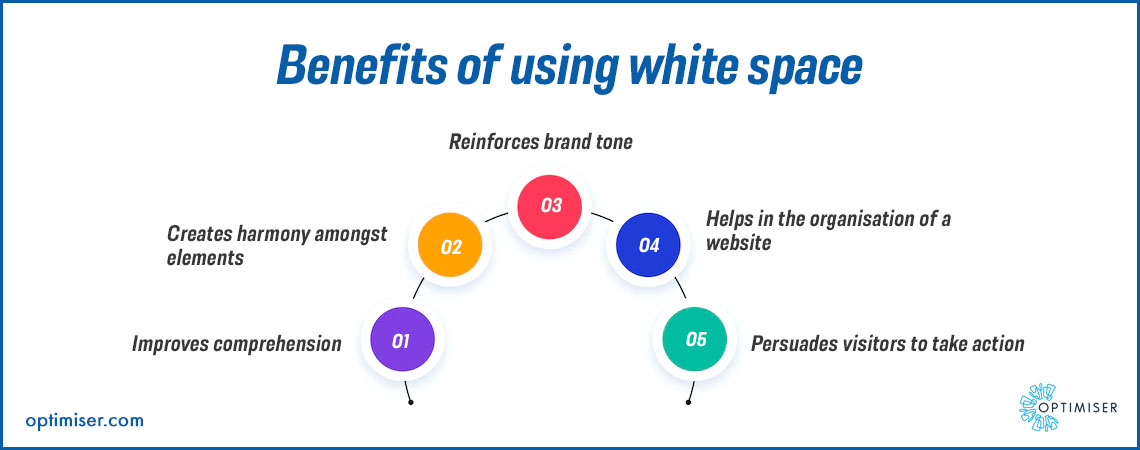
Benefits of using white space
Even if it is the invisible part of web design, it has an important role in user experience. It can help in boosting traffic to the website and building the brand image. Here are the benefits of white space:
- Improves clarity: With white space in between, the visitors will be able to comprehend the elements on the web page easily. They do not need to squint their eyes while scrolling through the webpage between the lines, words, images and letters.
- Harmony: A well-balanced website with ample white space can stand out well amongst all the competitors. Website is the threshold of building an impression on your potential customers. Aiding the visitors in feeling comfortable as well as focused with the help of the web design can make them feel safe and immersed.
- Reinforced brand tone: White space is a tool for communicating your brand personality and style to your visitors. It can be used to establish the brand identity.
- Organisation: To support the visuals, white space can be used to highlight the visual elements. Negative space helps in the formation of a flow between the content that is present on the website. It improves the site's usability and the visitors are likely to spend more time on the website because of it.
- Call to action: White space can compel visitors to take action. Placing emphasis near the CTA buttons can persuade the visitors to book an appointment or sign up for a newsletter etc.
White space in web design: Best practices
Use micro and macro space
Micro space is the area around the smaller elements like the text on the web page whereas macro space is the larger area on the website.
Both macro and micro spaces have their purpose. Micro space is used to boost readability whereas macro space is used to highlight the user experience by keeping the content organised and increasing its visibility.
Even the smallest changes in either macro and micro spaces can impact the visibility of the web page greatly.
Keep it simple
White space is used to highlight the existing elements in the webpage. It can capture the readers' attention towards the content that you want them to focus on.
Deciding how much white space to use is the trick, however. To use white space efficiently, consider these questions:
- Is the space looking too empty? or is it too cluttered?
- Will the visitors be able to comprehend what they are reading?
- Is the area that visitors need to focus on highlighted well enough?
- Is the white space enhancing the elements around it or is it encroaching on them?
Apart from the personal design that you prefer for your brand, it is vital to have enough white space to improve the focus of the visitors and elevate engagement. It will ensure that your website will not appear sloppy or too empty.
Management of visual hierarchy
Planning the visual hierarchy is important as it is the path that will be followed by the visitor when they are on your page. A messy website layout will put them off immediately and they are likely to move off to another website. Since they will not be able to figure out what details to focus on and where to go next, they will be interested in finding out things themselves. People prefer instant answers rather than going on a hunt to find them on your webpage.
White space can highlight the important part of the page, it will clear out the visual hierarchy for the visitors and allow them to focus on the elements that you want to highlight.
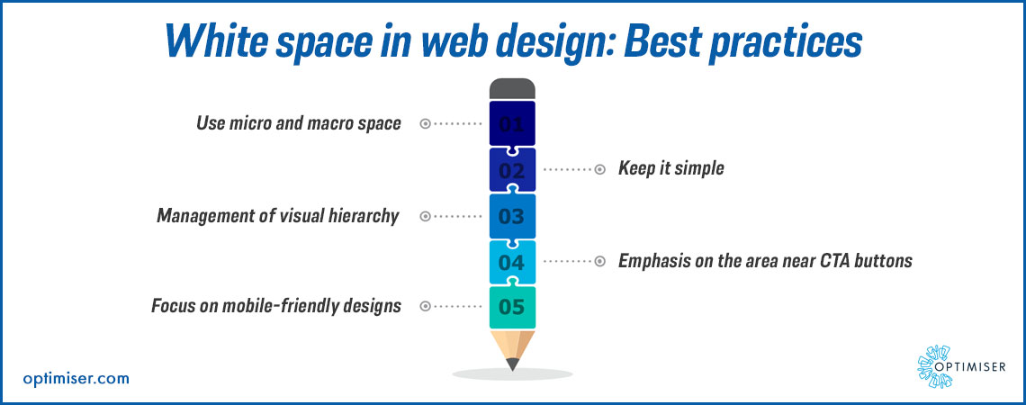
Emphasis on the area near CTA buttons
The white space around the call to action buttons can persuade the visitors to find them easily and click on them. Without any distractions, the visitor will book an appointment with your business.
Focus on mobile-friendly designs
Mobiles have smaller screens and white space needs to be mapped out equally carefully. Since most people are likely to visit your website on their phones, start with the mobile users' experience in mind.
Summary
White space can play a great role in establishing the brand aesthetics as well as keeping the viewers engaged. You will greatly benefit in terms of engagement as well as conversions.

30 days free trial. No credit card required